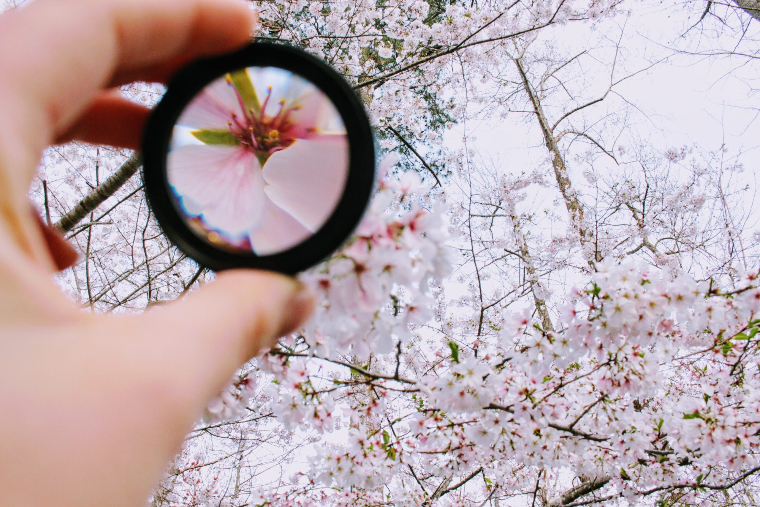
zoom is your friend (the design tool, not the video app/service, though it’s pretty rad too)
Hey, party people. I’m here to share a quick tip with you for logo design.
So when you’re designing your logo, whether you’re doing a wordmark (like Coca Cola) or it’s an icon or illustration or whatever, make sure you take a look at it zoomed out. Like, way out. Because I’m designing on an iMac Pro, I have to remind myself to do this pretty regularly. I’ve got this big, beautiful screen, and everything looks glorious. Until I zoom out.
What we have to remember is, the size that we’re looking at as we’re designing is usually not the size the logo is going to be when it’s “out in the wild.” At the very least, we know or can assume it’ll need to be smaller at some point or in some capacity. When you zoom out, what you’ll often see is that you haven’t used enough negative or white space. And when that happens, the elements of your design are way too close together, the design gets muddied up, and you really can’t tell one piece from another. Zooming out lets you see what your logo is going to look like from a variety of perspectives and sizes, and allows you to catch those flaws before anything is published or goes to print.
You also need to zoom in if your logo is ever going to be scaled up to a much larger size. And again, think about zooming in/out “to scale,” or to the size it’s actually going to be. If it’s going to be on a business card, then you need to make it that small and see what it looks like. The most common issue we typically see when we use zoom as a tool is the use of white/negative space, whether it’s in the space between the letters, or it’s in an actual design between shapes. We also might notice the colors are not necessarily performing the same; the more subtle or muted the color, the more we lose them as the design decreases in size. Which, coincidentally, can also create too much white/negative space. If we can’t see it, then it might as well not be there.
And there you have it! Zooming in/out is your friend! Use it well, use it often.
Peace.
April 10, 2020

Be the first to comment